We all have encountered pop-ups while scrolling through websites on the internet. While some are annoying, other ones are so well-designed and well-written that they almost make you want to buy immediately. On average, pop-ups have a conversion rate of 3.09%. However, it’s not surprising that some pop-ups have a conversion rate that is as high as 60%.
A good pop-up design can generate a large number of sales and help businesses engage with the masses. They are pleasing to the eye and even more so, interesting to look at. That is why the customers love seeing those and respond to them. Some of them are so well-written that they make the customer want to subscribe to a website just so they could see more of these.
What are pop-ups?
Pop-ups are a technique of advertising on the internet. It is a graphical user interface (GUI) display area that is usually designed as a small box on a user’s screen. They appear after the user performs a certain trigger action such as clicking a certain button or simply scrolling through the website. They generally appear in the foreground of the website, blurring the background.
Over the recent years, pop-ups have proved to be a strong marketing tool for online businesses. They can help businesses in collecting a user’s contact information, promote their products or announce a sale. As marketing and designing techniques improve, businesses are getting more creative with these. They can be a powerful tool to collect user data and drive traffic to your website.
Digital marketing is headed for exponential growth over the upcoming years. Businesses need such powerful tools if they want to survive doing business online. Online businesses are all about getting more visitors to your website and convert most of those visitors into loyal customers.
Why and how pop-up design matter?
We all agree that pop-ups can be irritating. Nobody wants to stop and enter their details while they are enjoying reading a blog post. Customers need something good enough to be spending their time on. This is exactly why businesses should work on creating pop-ups that make it worth their while.
Their designs can vary depending upon what purpose they are serving. Email collectors, discount offers, product updates, and many more. It depends on you how you want to utilize them to benefit your business.
The way you design pop-ups for your website can highly affect your conversion rate.
If you are asking a customer for their time and attention, you should put some effort into making those requests visually pleasing and empathetic. Don’t worry you don’t need to be a designer to come up with great designs for your pop-ups. There are many applications and automations in the market that can help you with the task. Canva, Emailwish, Figma, and many more. You can use these to design beautiful pop-ups for your website even when you are not a professional designer.
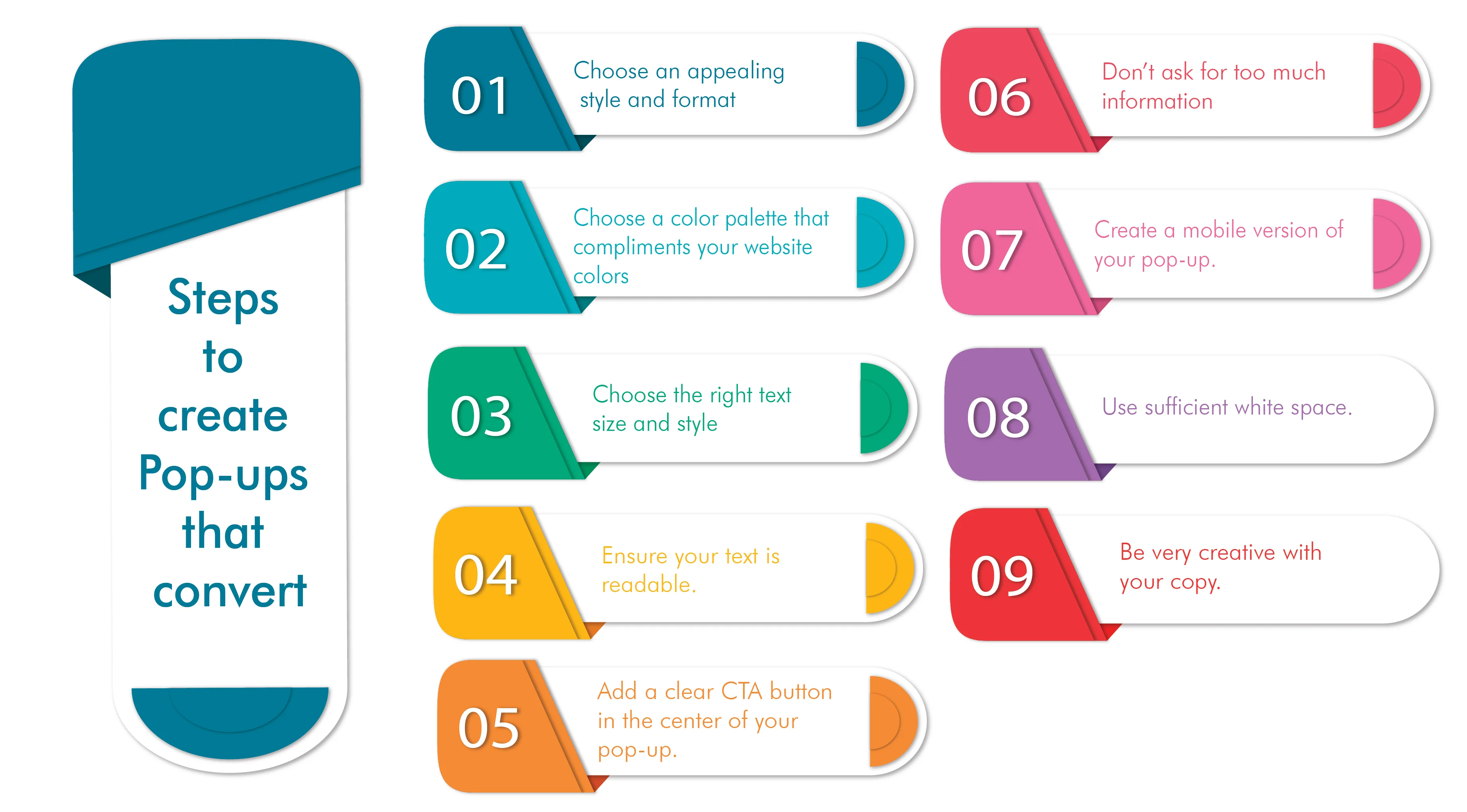
How to create pop-ups that convert?
Many factors decide whether a pop-up is good or not. The pictures used, the color palette, text style, trigger action, how much time is required by the pop-up to show up after the triggering action is performed. All these factors determine their conversion rate to a great extent. For example, research shows that 92% of the pop-ups that display have a conversion rate of 10% or more are the ones that display after 4 seconds.
Let us discuss some tips and tricks for your pop-up design that will help increase the conversion rate of your pop-ups.
1. Choose the right format and appealing style for your pop-up
Before starting to build your pop-up, make sure you know what you’re going to create. Is it a product update, a discount code, or simply a sign-up form? Once you have decided this, choose the actions that will trigger the pop-up and how it will appear on the screen. Would it be a slide-in, a pop-up, or a bar that sits on the top of your website?
The type of form you choose varies with the type of information you’re trying to deliver or collect. Let’s see which of these forms work best for your business.
1.1 The pop-up

This pop-up is the most sudden and direct form of pop-ups. A pop-up will appear in the middle of a user’s screen with a certain call to action. These pop-ups are usually sed as exit-intent pop-ups i.e. they get triggered when a user is leaving your website. These pop-ups are generally used to collect a visitor’s email addresses to create a mailing list and conduct email marketing campaigns in the future.
1.2 The slide-in
These pop-ups appear at the bottom corners of the screen. They do not interrupt a user’s view of the website. As this slide-in will appear while the user is still scrolling through your website, make sure you choose a color palette that compliments the colors on your website.
These pop-ups can be used for product teasers or discount codes. They usually have a polite tone for the user as they do not interrupt their scrolling on the website.
1.3 The bar
These pop-ups usually appear at the top of your website below the navbar. They appear like big banners usually used for promoting a big sale or discount offers. Usually, shopping websites use these pop-ups for displaying their most discounted products or upcoming deals for the users.
These are effective because they direct the users directly to the most discounted products that urge them to buy. The product updates in these pop-ups keep the users excited for the next sale or new incoming products.
Emailwish allows you to create such beautiful pop-ups in less than 30 seconds. You can choose from different font and color styles, different shapes, and trigger actions, and create whatever you feel will be the best for your website. These pop-ups don’t need integrations, they come inbuilt with EmailWish automation and thus, do not affect the loading speed of your website.
2. Use a design and color palette that compliments the design and colors of your website.
There’s no such condition as to which colors you can use while creating a pop-up for your website. However, the best pop-ups can only be designed if you keep your website’s color palette in mind while choosing the colors for your pop-ups. You wouldn’t want to choose the colors that hurt your website’s visuals. Especially in the case of slide-in pop-ups. The user can see both the content on your website and the pop-up and compare the colors side-by-side.
You can create your own color palette or take help from the color palette-creating tools that are available in the market. Some of them are Khroma, Coolors, Colorspace, and many more. These tools will allow you to choose the right colors for your pop-up that can accurately depict your intent and mood of the pop-up.
Choosing the right colors is not the only factor you need to pay attention to. Choosing the right design for your pop-up is also necessary. How will you arrange the text around the other elements of the pop-up, where will you include the CTA button, all these play an important role in determining how a good or bad a pop-up looks.
3. Choose the right text size and style.
The typography on a pop-up is also a part of that pop-up’s design. Always keep in mind that text is the most important part of a pop-up. Choose the right text style and size for your pop-up if you want the user to seriously read that text.
Use a font that matches the voice and tone of your message and your business. Text size and style can highly determine the mood and tone of a pop-up. Using a large text size and an aggressive font for your CTAs can grab more attention? No, instead it sounds like you’re screaming at the user to buy from them. Don’t do that. Always keep empathy in your designs and typography.
Never use a text size and font that is too big and dramatic. Always keep the niche of your business in mind and decide accordingly. For example – if you are a B2B business, it is better to use a more subtle and formal font and medium text size, on the other hand, if you’re a B2C business, you can experiment with fun text styles and varying text sizes.
4. Ensure your text is readable.
A pop-ups main intention is to grab a user’s attention and deliver them a certain piece of information. Even a pop-up that is designed carefully can have a low conversion rate. How? Well, a great pop-up design is likely to grab a visitor’s attention but what then? What is the use of grabbing a user’s attention when you cannot deliver the message to them?
If you are using a picture as the background in your pop-up, make sure you use color blocks to increase the readability of your text. The same goes for your CTA buttons. Choose a text color for your text that has good contrast with the color of the button and is easily visible to the user.
5. Add a clear CTA button in the center of your pop-up.
The main purpose of the pop-up is to get the user to perform a certain action. It can be anything. A form where the user will need to enter their email address, a button that takes the user to a certain part of the website, or a button that leads to the checkout. These buttons are called Call To Actions or CTAs. The entire copy of the pop-up is written to eventually get the user to click that button.
So, if this button is this important, it should be the central part of your pop-up. A big clear, the Call to action button can highly increase your conversion rate. Similarly, you have to be careful with the copy you use for this CTA button. What you write on this button will determine to a great extent if the user will take the action or not.
Some pop-ups consist of two CTA buttons. One that encourages the user to perform a certain desired action and the other that has a negative button copy such as “No, I don’t like discounts” or “No, I don’t want gifts”. These negative buttons confuse and irritate the visitors as to what action they should take. This should be avoided.
Always include a very clear and straight CTA button in your CTA button copy. If you are asking for a user’s email address, your CTA should clearly tell them what they are getting themselves into. For example – A pop-up that requests a user to enter their contact details should be followed by a CTA button like “Get your free Ebook now” or “Click to enter the contest”. This will prevent visitors from hesitating in entering their details because they know they will gain something out of it. Doing this will also increase the click, open and read rates of your email campaigns because the user will know it is something they subscribed for.
Therefore, always remember, never use a language in your CTAs that is annoying or confusing for your visitors. Be very empathetic and respectful.
6. Don’t ask for too much information.
How would you feel if you are peacefully reading a blog post or scrolling through a shopping website and suddenly a long-form shows up that you need to fill to continue scrolling? Annoying right? That’s exactly how your visitors feel when they have to enter too much information in a pop-up.
Pop-ups should appear on a user’s screen only for a short time to not become annoying. They should carry little information and should be to the point. Therefore, always refrain from adding too many input fields while creating a pop-up.
It is always better to have as much information about your customers as possible, however, it’s neither necessary nor possible to collect all that information in a single go. Always be patient in business. If you use a pop-up that only requires a user to enter their email address, it won’t take much of their time and they wouldn’t mind filling it. On the other hand, too many input fields may irritate them and they never even visit again. Once you have their email addresses you can always follow up via email or text messages. Besides that, you can always learn from a user’s visits to your website once they have subscribed.
7. Create a mobile version of your pop-up.
According to research, people spend almost one-fourth of their time on mobiles. This is why every business launches a mobile version of their website for better conversions. It is always advisable to create a mobile-friendly version of your pop-up. Recently Google introduces its new interstitials policy. According to this policy, site owners were to be punished if intrusive pop-ups were misused on mobile.
This will also prevent your pop-up from looking absurd on mobile screens. A mobile screen is smaller and therefore, the design of a mobile pop-up will vary. It will contain lesser elements as compared to the desktop version.
With Emailwish you can create both the desktop and mobile-friendly versions of your pop-up simultaneously. You can see how your pop-up will look on different screens and remove the unnecessary elements and input fields while working on a mobile version of the pop-up.
8. Use sufficient white/blank space.
Most marketers tend to forget the importance of spacing while creating pop-ups. In the need to add more content on the pop-up, they ignore spacing. The spacing is also a part of your design and highly affects the overall look of the pop-up.
Improper or inadequate spacing can cost you your conversion rates.
When it comes to proper spacing, consistency is the most important. Use the same spacing between two words in the text, two lines of text, or two different elements on the pop-up. This also includes the spacing of your content from the four corners of your pop-up. Using different spacing may make your pop-up look bad and unprofessional.
This spacing is also necessary for highlighting the main content on your pop-up. If there’s too much information and no spacing, it will be hard for the user to distinguish the main CTA from the rest of the text on the pop-up.
EmailWish offers you beautifully designed, pre-built pop-ups. These pop-ups are designed by experts who have sufficient knowledge about the design elements and spacing. Your pop-ups will look amazing and your CTA copy will stand out due to the proper use of spacing and justified alignment.
9. Be very creative with your copy.
Copywriting is the most important part of a pop-up. This is what the users are going to read. It determines whether the user will act or not. This does not happen magically. A copywriter has to think of all the little details and aspects that might come into a user’s head while they are deciding to respond to a pop-up.
The copywriting styles vary depending upon the action required from the user. For example, the conventional “Subscribe Now” buttons are not that effective today. Instead, button copies like “See what’s inside” or “what you’re missing” work more effectively.
Here’s the thing. A user will always hesitate in performing an action that involves spending money or taking risks. This is why when a user reads ‘Buy Now”, they know they will have to spend money. However, CTA buttons like “See what’s inside” work well, because they make the users feel safe. It couldn’t possibly hurt their pockets to see what you are offering.
These small details can determine the conversion rate of your pop-up to a large extent. To be more effective with your copy, always think about how your writing would make the user think and feel. This shouldn’t be hard because we all have been users at some point. Keep yourself in your user’s place and you’ll be able to come up with some creative ideas for your pop-ups.
Conclusion
Pop-ups can seriously affect your conversion rate if created in the right manner. Keep all the above details in mind while creating your pop-ups and it will feel like a piece of cake. If you still face problems, you can always rely on automation tools like Emailwish. They come with lots of pre-built pop-up designs and you can choose the right ones for your business. This way you will be able to create beautiful pop-ups with good conversion rates within seconds.