The secret to writing good CTA buttons
The world of marketing solely exists to generate more sales. At the end of the day, it’s the revenue you generate that decides the success of your marketing campaigns. Call to action or CTAs are the most important things on your website, emails, notifications, pop-ups, and everything you use to make a sale.
Everything you write on your website is written to eventually lead the user to take a certain action. You start from a broader topic or address a broader, more common issue and eventually narrow it down to the problem that your product or service can solve. The overall structure of your marketing content eventually looks like a funnel. This is why it is known as a sales funnel. At the end of this funnel lies a CTA which leads the user to make a purchase.
What are CTA buttons?

A CTA or Call to Action is a marketing term for any text or design that prompts the user to make an immediate purchase. It guides your audience towards what you want them to do. They are added to a website or a sales message with the true intent to sell.
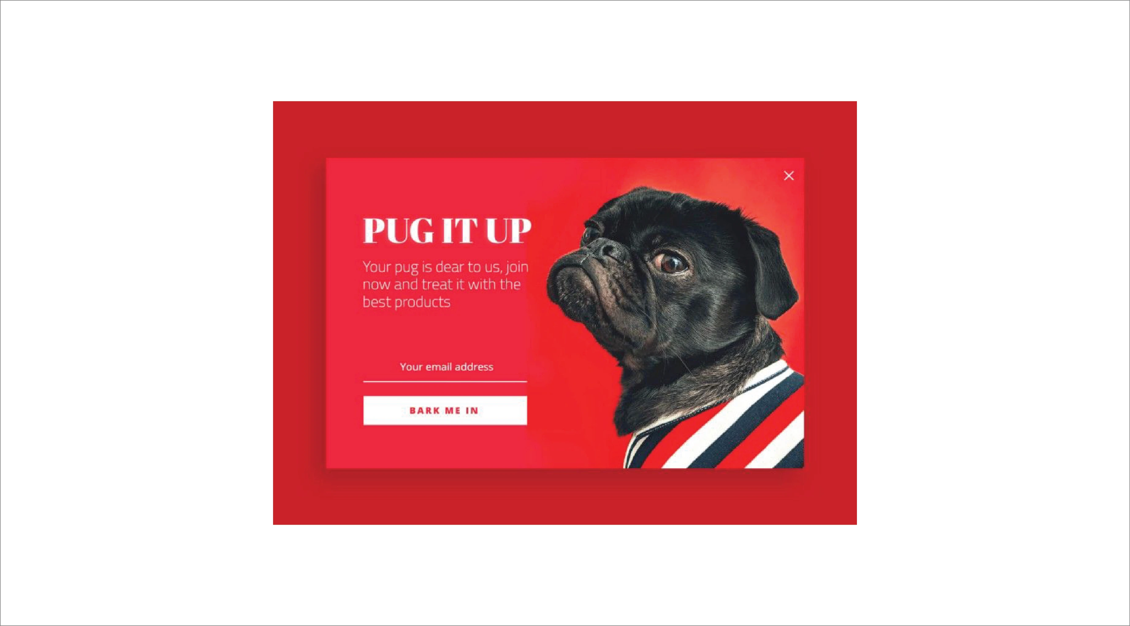
Call to Actions can be written and designed in many different forms depending upon what you want your readers to next. For example, if you have launched a new product or a new update and want your users to take a look at it, you can create a CTA saying – “ Check out what’s new” or “Show me what’s new”
Sometimes, an additional CTA is added to give the user more options and decide if they want to. For example – if you want the user to sign up for a program you can add two CTAs saying – “ Sign up now” and “Maybe Later”. Giving more control to your users increases our chances of making a sale.
How effective can a CTA button be?
A well-designed and creatively written CTA button can generate more traffic than the rest of your content. You can brag about your products and services all you want but if your CTAs are not well-written, you will repel customers.
As far as creating a good CTA button is concerned, you will find thousands of tips that eventually conclude in a few basic rules. These rules are the backbones of the marketing world. The origin of all these rules is empathy. If you understand human nature, you will know that people don’t really care about your product, they care about their problems and about how they can solve them. So when you create a CTA button, keep in mind that you have to first provide a solution and then convince your solution to buy that solution from you.
How can you improve your CTA buttons to get more conversions?
If you ask me why we need to improve our CTA buttons, I would say “because they can still be better”. The internet is improving each day, technology is getting smarter. You can leverage the internet to understand your users to the best of your abilities. Marketing is all about how much you know the user. The more insight you have on your users, the better your marketing campaigns get because you offer what people need. If not, then offer your product in a way that convinces the user that it’s useful for them.
Writing a CTA button is not just about telling the user what you want them to do. It’s about analyzing your customer’s behavior and making predictions about what will work better. The creative copy, font, text size, the color of the CTA button, every little detail can affect how the user reacts to your CTAs. It’s better to have a clear idea of your user’s general behavior than risking your sales.
Directing more traffic to your website highly depends on your CTAs. If you sound too salesy, that is also going to leave a negative impact. This is why CTAs that do not indicate a direct or immediate checkout process tend to work better than the CTAs that directly scream “BUY” at the user.
Tips to creating better CTAs
Here are the Six tips to get your CTA game up and running. Write good CTAs and see how you sell out as soon as you advertise!
1. Pay attention to your Funnel.
A sales funnel is written before the CTA button to grab the user’s attention and build a connection with them. The whole intention of the sales funnel is to convince the user to click on the CTA button and make a purchase.
To write a better selling funnel, you need to understand your user’s behavior. Only then will you be able to write with empathy. Here’s the thing, every
Pay more attention to the “why” part of your product rather than the “what part” of your funnel. Here’s the thing, there may be many other companies who would be providing similar products or services like yours, so how do you differ from them. One way of doing this is speaking about why you’re doing what you’re doing and what you aim to achieve. This is because in this way you can attract people with similar beliefs and interests. Be storytellers, not just salesmen. People are not interested in “What” your product is, they are interested in “why” they should buy from you.
A sales funnel always starts with a broader perspective about why a product came into existence at all. For example, if you are trying to sell sports shoes, you can talk about why sports is necessary then about why comfort is important in sports, how your shoes can affect your performance, and then how you can help in finding the right shoes for them. All of this will eventually work as a set-up for the final action you want them to take.
2. Size, shape, color and positioning of the CTA button.
While the design is an important aspect of a sales page, it is better to keep your CTA buttons as simple as possible. You can be a little creative with your copywriting but except that, the color, the design and the placement of the CTA button should be very minimal.
2.1. The size and shape
If you feel like, a bright color or design may grab your visitor’s attention, that’s not completely true. Loud and catchy colors could harm the overall aesthetics of your design and may even leave a negative impact on your CTA button. Try to use colors and fonts that compliment your website’s theme and design.
Your CTA button shouldn’t dissolve among the rest of the content on your page. It should stand out. Even wondered why CTA buttons are usually rectangular? They can be rounded rectangles because many people believe that rounded corners seem more positive and are easy to process visually.
If we talk about, the size of your CTA button, it is usually the largest button on your page. It should be easily visible and grab a user’s attention instantly. A user shouldn’t have to about where to click to get what you’re offering.
2.2. Placement on the page
The last is the placement of your CTA button. This button is the most important button on your page. So, it shouldn’t disappear among other elements on that page. It should be placed neatly, at a good spacing from the rest of the text and images. A user should instantly know which one is the CTA button from where it is placed. You can either place it at the beginning of your web page or the bottom or both.
Placing the CTA button at the top is considered ideal because this way, it will be the first thing a user notices when they are reading. So consider doing this when your service is straightforward and free and doesn’t need the user to read a lot before diving in. On the other hand, placing a CTA button at the bottom helps the user make an informed decision. This is why most pages that are related to purchase have their CTA button placed at the bottom.
3. Create a need or urgency.
People don’t need your products, they need solutions to their problems. Honestly, I can’t say this enough. It is so obvious yet businesses stay oblivious to it.
To make a sale, you first have to convince the user that your product is their need because it will solve their problem.
You can also convince the user to click a CTA button by creating an urgency such as “Limited time deal” or “Hurry, limited stock”. Using this method makes the user feel like your products are authentic and good enough to be sold out this early. This encourages the user to buy the product before anyone else can.
4. Creative Copywriting.
The way you write a CTA button deeply affects the number of people who may click it. To be able to write effectively, you first need to understand basic human behavior and write accordingly. Know your audience well and write in their favor.
For example, reading “Buy Now” makes the user realize that they are going to be spending money or giving something in the next step if they click this button. This may make them hesitant. However, if you use words like – “Make them mine”, it radiates a sense of giving. The user feels like he’ll be getting something if he clicks that button.
Similarly, if you’re giving something for free, be sure to mention that in your CTA button. Use words like “Get” and “Free” which assure the user that they are receiving something without actually have to invest anything except their time. The more value you provide, the more likely you are to make a sale in the future.
5. Relate to the past actions.
As I mentioned earlier, a sales funnel starts with a broader explanation of your product and eventually narrows down to the product. Always remember, all this content should be relatable. Try not to write something irrelevant to your product or the user.
If in the funnel you say, “you can register yourself for the free program” then your CTA button should say something like – “Register for the program” or “Enroll in the Program”. This clarifies to the user that they can enroll in the program you previously talked about using this CTA button.
If your CTA button was something like – “Know more”, the user might get confused about where can he actually register for the program that you’ve talked about.
6. Give choices to your users.
Empathy is the base of all sales. A person who can relate to and solve a user’s problem most certainly knows the art of selling.
Some people use confusing CTA buttons to attract customers such as – “Get my free coupon code” and “I don’t like coupons”. These are obvious efforts of getting more conversions but sadly, it doesn’t work this way.
People are smart, they will still do what they want. You can’t fool them with tricks like the above. These can even be frustrating sometimes. So if you do add multiple buttons, make sure you’re giving them a choice, not imposing it on them.
7. How can we help?
Emailwish helps you create beautiful pop-ups and provides you with thousands of beautiful pre-built email templates. All of these are designed and creatively written by professionals and marketing experts. Careful research and study is used for creating these templates to ensure more leads and sales.
Conclusion.
The first rule before writing a CTA button or any sales pitch for that matter is to keep in mind your own behavior. I mean we all are users after all. We can always learn from what captivates our attention and makes us want to buy something or click a certain button. Lastly, you can leverage automation platforms like Emailwish to leverage prebuilt templates and get faster solutions to your marketing problems.