Marketing has taken so many different forms while it has evolved in all these years. Businesses have realized the importance over time and more focus has been set on enhancing the conventional marketing campaigns and strategies. Today, a whole new method of marketing, commonly known as Digital Marketing has dominated the other conventional ways. It is a marketing technique that leverages the internet, digital technologies, and digital platforms to promote and sell a product. Call-to-Action or CTAs are the most important components of marketing campaigns, be it digital marketing or traditional offline marketing.
A Call-to-Action button is a section or button on your sales page, email, or website to prompt the user to take the desired action, generally making a purchase. CTAs are important because they extremely affect the number of leads you generate and the number of sales you make. A well-written CTA button can increase your conversion rate by up to 22%.
As marketing techniques are evolving, marketers all around the world are getting more creative with their CTA buttons. By collaborating with designers and creative copywriters, they are trying to design more effective CTA buttons that can drive more traffic to their website. Businesses are coming up with creative ideas and researching user behavior every day to create better user interfaces and user- experiences. This includes the CTA buttons.
Some companies out there have mastered this game and created some amazing CTAs that generated thousands of new leads for them and help them make more sales. We have collected a few such examples and put them together so that you can refer to them whenever you need some inspiration for creating CTAs for your business and the reasons why these CTA buttons work so well.
1. Spotify’s Go Premium CTA buttons.
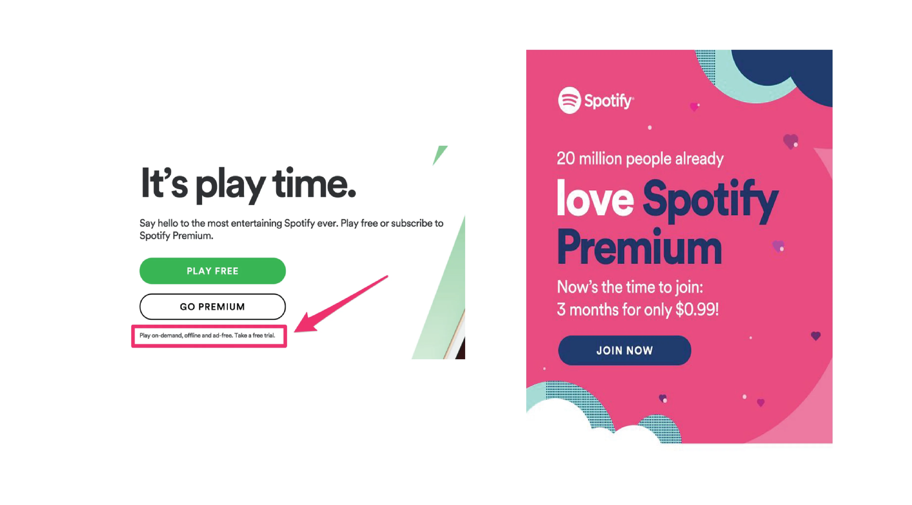
Spotify has always been famous for its creative ads and marketing campaigns. If you’re also a Spotify user, and you haven’t purchased their premium plans then you must be familiar with the Spotify voice-over ads. The voiceovers themselves have strong Call-To-Actions at the end of the Voice-overs.
Besides these Voice-overs, Spotify also runs ad campaigns from time to time. These ad campaigns are targeted and straightforward. Spotify has two main goals, one – to promote its music and second to sell its premium plans. In these cases, it is difficult to decide what CTA to use. Spotify has used two CTAs to solve this problem.
Most of their ad campaigns contain two CTAs, one promoting their premium plans and the other one allowing their users to access their free music. This gives complete control to the user. It allows the users to check out Spotify’s premium plans if they want or continue to listen to their music if they are not interested in the offer. This is one of the reasons Spotify’s customers love the platform. There’re no such restrictions posed on the users even when they are on the freemium plan. The CTAs clearly display this message in a straightforward way.
Spotify also runs separate ads for its premium plans. One of them is displayed below. Even in this advertisement, the CTA is very clear, if you love unlimited music, you can buy a premium plan for 3 months at just $0.99 by clicking on the CTA.
2. Missguided’s cute Treat Yourself CTA buttons

Missguided has made it into our best emails list before and here it is again. Missguided’s CTAs are as creative as their emails. The brand communicates with its customers like a friend. This is the main highlight of the brand’s creative copy. It makes the customer feel at ease. The customer doesn’t feel like they are getting sold into something rather they feel like they are doing something good for themselves.
In one of the company’s email campaigns to re-engage their existing customers, the brand used a CTA like this – “Treat Yourself”. Although it looks simple, it worked amazingly for the company. Why? This was written keeping in mind a customer’s state of mind when they read the email.
Missguided knows that It’s not necessary that a customer is ready to instantly buy from them right after they see their email. They might not be ready for direct selling CTAs like “Re-visit Now” or “Buy Now”. So they decided to use the words that would excite “Treat Yourself”. These words give the user a feeling of self-love. It makes them feel like it’s a way for them to make themselves happy rather than raising the company’s profit.
3. AnnTaylor’s CTA buttons that create urgency.
Ann Taylor is an American Apparel Brand for women. The brand has launched several creative and successful email and ad campaigns. The brand often leverages creative design and copy to make its campaigns stand out.
Ann Taylor’s CTA buttons are simple, they create urgency. Not by forcing the user into buying but by making them feel like they will miss out on being exceptional. Yes, this is a strategy applied by many luxury brands to give an exclusive feel to their products.
By making the customer feel like they can stand out from the rest by owning a particular product from their brand. Clearly, such brands target audience who believe in being unique and are ready to pay any price for it.
As you can see from the image, the brand has cleverly used a GiF to represent the limited time before their best deals are gone, and to finish it off perfectly, they have created a CTA button saying “Don’t miss this”, which creates the urgency for the user to buy before they miss the sale. In the second ad campaign too, they have first created a need by pinching on the common problem every girl complains of – “I have nothing to wear”.Using this sentence they have created a need and then offered a solution in their CTA button.
4. BirchBox’s playful CTA buttons.
BirchBox is a New York-based beauty brand that offers a monthly subscription box service. It sends a box with 4-5 beauty items to its subscribers each month. From the store’s aesthetics to ad campaigns, Birchbox’s customers love everything about the brand. The CTA buttons used y BirchBox in its Emails and Ad campaigns are worth taking inspiration from.
The first sales email sent by the company after a new user subscribes is the email given below. It is simple and doesn’t sound at all salesy. It feels like a warm welcome and Birchbox has made sure that it makes its users feel special by using creative sentences like – “We see something bright in your future”. Does this look like a sales email at all?
Following the exciting heading is the message for a Free price. Notice how so far, the brand hasn’t asked for any subscriptions or commitments. The free prize message is followed by a beautifully written CTA – “Let’ Play”. This CTA not only creates excitement among the users about the game they are gonna play but about what they are going to get in their first box.
This CTA helps to avoid the hesitation a user might feel thinking they may have to spend money if they click this button. Instead, it excites them and draws them in.
5. Away Travel’s Surprises.
Away is an American company dealing in travel bags and much more. At first sight, Away appears to be a very formal brand. However, the company goes a step further in its marketing game. The company offered a gift set to its customers including a miniature case for toiletries, an Aesop Jet Set Kit, and cushy travel socks. The company decided to lead its customers to these gift sets directly through their CTA button.
Including the CTA button saying – “Shop the gift set”, the brand is trying to create excitement among its customers about the gift set. Another reason why this CTA works this well is that when most people think about travel bags, they feel like there can only be limited options. They don’t usually expect too many choices or options. Another reason is that when people think of a travel bag, they feel it must be expensive.
Giving people so many options gets them excited about checking out other products from the brand and visiting their website. AwayTravel also offers a gift card using which users can pick what they want and some extra perks. Away makes all these available through a single click on their CTA button.
6. Krave’s sympathetic and straightforward CTA buttons.
Krave is a beauty brand selling skincare products for all skin types. Krave beauty, besides being a wonderful brand, is also a great marketer. The brand uses the most basic component needed to win over any type of audience – sympathy.
At every step, you will find that the brand voice of this company tries to address any tiny problem their users might face. This includes simple and easy to understand product descriptions and creative product names.
The same goes with their emails. They are very direct about what problem they are addressing in their email and at the end, the user can see a solution by clicking in the CTA.
In the first email given here, they have written a very clear headline. A user can tell what the rest of the mail is about just by reading the headline. In the text they have briefly described the product. At the end, their CTA directly targets the user but the tone implies that the user will click it only if they want it. This way the user doesn’t feel sold, they feel like they bought the product because they wanted it.
Similarly, in the second email, the headline boldly speaks of the problem that the email intends to solve. At the end, they have provided the hint to an obvious solution and left the decision on the user. Using the words – “Tell me”, they make the user have the control over the information, which again encourages them to click the CTA button, because they would obviously want to know the solution.
Conclusion
No matter how perfect we become at something, we still need some inspiration from time to time. This is why this list will help you when you find t difficult to come up with creative ideas. Just like these examples, Emailwish can also help you. In fact not only inspiration, but this automation tool will help you create beautiful email and pop-up designs with creatively written CTA buttons that have the potential to generate new leads for your business.
Also read – The secret to writing good CTA buttons